Latest Post | Last 10 Posts | Archives
Previous Post: Unclear on the concept
Next Post: Meanwhile… In Opposite Land
Posted in:
* A few comments on a post about some new state laws yesterday were a hoot, particularly this one…
I don’t believe that Illinois has any need to design or adopt a new/better/different/progressive state flag. Those pushing this agenda aim to abolish history, like Lori Lightfoot removing the Christopher Columbus statues in Chicago.
“The first of these was adopted on July 6, 1915, after a campaign by Ella Park Laurence, State Regent of the Daughters of the American Revolution.” This is what the leftists don’t like, pesky reminders of the people that founded this state and nation.
Hilarious.
* To the synopsis…
Establishes the Illinois Flag Commission Act. Creates the Illinois Flag Commission for the purpose of developing new State flag designs and making recommendations to the General Assembly concerning whether the current State flag ought to be replaced with a redesigned State flag. Identifies the members to be appointed to the Commission. Describes the duties of the Commission. Requires the Chair of the Commission to convene the first Commission meeting by no later than September 1, 2023. Requires the Commission to report its recommendations to the General Assembly by no later than December 3, 2024. Provides for the repeal of the Act on January 1, 2026. Effective immediately.
One of the top proponents of Senate Bill 1818 (get it?) is former Rep. Tim Butler, a Springfield Republican and hardly a leftist progressive.
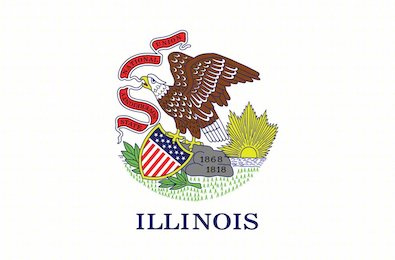
* And abolish history? Here’s the flag…
Let’s see, there’s “1818″, the year Illinois became a state. “1868″ is the year Illinois adopted a new state seal, which is hardly an historically significant fact except that it’s a self-referential nod to the flag’s design…
Illinois Secretary of State Sharon Tyndale spearheaded the drive to create a third state seal for Illinois. In 1867, he asked State Senator Allen C. Fuller to introduce legislation requiring a new seal, and suggested to Fuller that the words of the state motto be reversed, from “State Sovereignty, National Union”, to “National Union, State Sovereignty”. However, the bill passed by the legislature on March 7, 1867, kept the original wording. Despite declining his suggestion, the legislature nonetheless entrusted Tyndale with designing the new seal. And Tyndale managed to (literally) twist the legislature’s intent; he kept the words in the correct order on the banner, but the banner twists, so the word “Sovereignty” is upside down, arguably making it less readable.
So, the state seal, which is on the state flag, violates legislative intent.
Lovely.
* And the design was so non-Illinois that the state actually added the word “Illinois” to the flag in 1970…
In the 1960s, Chief Petty Officer Bruce McDaniel petitioned to have the name of the state added to the flag. He noted that many of the people with whom he served during the Vietnam War did not recognize the banner. Governor Richard B. Ogilvie signed the addition to the flag into law on September 17, 1969, and the new flag, designed by Sanford (Florence) Hutchinson, became official on July 1, 1970.
* And who the heck is reminded of the founders of our country by looking at the state flag? Ella Park Lawrence was designated “Honorary State Regent of Illinois for life” for her work to pass the flag bill. But, I gotta say it, the flag she helped choose is subpar.
If you still need more convincing, here’s another commenter from yesterday…
The main reason we need a new flag is that Indiana’s flag is much better than ours, and we cannot be upstaged by Indiana.
*** UPDATE *** Rep. Dan Didech recently received an email from George Lonngren with his suggestion for a “Union State” flag…

I like that. Lonngren’s explanation…
It’s “The Union State” flag because our state is really a microcosm and representation of our nation as a whole. We are in the core of the country, we have provided greatly to its defense and preservation. We are a major portion of its breadbasket. Culturally we have strong communities of all groups large and small from all over the nation, and world. We have large cities and small rural communities. If you removed the other 49 states and just had Illinois, the American Spirit would be little diminished in Illinois’ sole contribution to our nation.
Blue Field: Illinois massive contribution to the union army during the civil war to preserve our nation
Lincoln Silhouette: The president who saw us preserve our nation, also from our state
Yellow Silhouette: For Illinois Agriculture
Stars: One for each president with strong ties to Illinois (Reagan, Grant, Lincoln, Obama).
Point being, let’s see what people can come up with.
posted by Rich Miller
Wednesday, Aug 9, 23 @ 11:03 am
Sorry, comments are closed at this time.
Previous Post: Unclear on the concept
Next Post: Meanwhile… In Opposite Land
WordPress Mobile Edition available at alexking.org.
powered by WordPress.
I will always remember some wise words of wisdom.
“I don’t get all choked up about yellow ribbons and flags. I see them as symbols, and I leave them to the symbol-minded.”
-GC
Comment by TheInvisibleMan Wednesday, Aug 9, 23 @ 11:09 am
No more discussion needed. The point about Indiana is overwhelmingly convincing.
Comment by Lt Guv Wednesday, Aug 9, 23 @ 11:09 am
I absolutely hate the argument that we can’t improve something just because the dumb or bad thing that already exists is old. Lots of old things can and should be removed or improved.
Comment by Homebody Wednesday, Aug 9, 23 @ 11:17 am
=== I absolutely hate the argument that we can’t improve something just because the dumb or bad thing that already exists is old. Lots of old things can and should be removed or improved. ===
I never feel the “erasing history” argument is good faith. The history books and wikipedia are still going to have images of the old flag. I’m sure some museums somewhere will have them. The history isn’t going anywhere if they introduce a new flag design.
Comment by ChicagoVinny Wednesday, Aug 9, 23 @ 11:22 am
We gotta do a lot better than the Illinois license plate.
Comment by Joe Schmoe Wednesday, Aug 9, 23 @ 11:24 am
Our flag defies most good design principles:
https://99percentinvisible.org/article/vexillology-revisited-fixing-worst-civic-flag-designs-america/
Comment by unionguy Wednesday, Aug 9, 23 @ 11:24 am
I would venture to guess, that if you had polled the people of Illinois, lets say….2 years ago or so…or 5 years ago….or 10 years ago….and said, “what is it that you would like from Illinois Government?” I am guessing here…but likely 0 percent of respondents would have said “a new flag.”
However…we will have a new flag, because that is what progressives do, change things, that no one asked to be change, or cared to see change, just for the sake of changing. It’s ridiculous, not needed, but so much of Illinois Government is exactly that.
Comment by James Wednesday, Aug 9, 23 @ 11:25 am
Vexillographers, or people who study vexillography (the study of flag design) will tell you that good flags follow these design rules:
1. have no more than 3 colors
2. include large and recognizable symbols that represent something
3. No words
Flags that score well include the U.S. Flag, Washington D.C. flag, and City of Chicago flag.
Count me in favor of a new flag that can inspire me: I vote for red flag with 102 mini stovepipe hats to represent Lincoln/102 counties.
Comment by Just Me 2 Wednesday, Aug 9, 23 @ 11:28 am
Numerous states besides Illinois have “seal-on-a-bedsheet” flag designs, and they’re uniformly awful. Too hard to draw or print, too many fiddly little details to see, and too alike to each other. It’s going to be hard to come up with a new flag that’s worse.
Comment by Benjamin Wednesday, Aug 9, 23 @ 11:28 am
Those pushing this agenda aim to abolish history, like Lori Lightfoot removing the Christopher Columbus statues in Chicago.
——
Like when Republicans push their agenda that slavery was a Study Abroad program.
Comment by Jerry Wednesday, Aug 9, 23 @ 11:31 am
That Illinois’ flag is completely uninspiring- seems like a flag we should all be able to rally around.
Comment by West Sider Wednesday, Aug 9, 23 @ 11:36 am
Indiana was trying to compete with Alaska when they designed their flag. Too bad Indiana lost.
Comment by Huh? Wednesday, Aug 9, 23 @ 11:36 am
I like the four-star yellow-Lincoln flag here, but keep in mind that I will almost certainly like any flag design better than our current state flag, because it is truly terrible
Comment by The Truth Wednesday, Aug 9, 23 @ 11:42 am
===Point being, let’s see what people can come up with.===
Agreed. It worked well in New Mexico and elsewhere. I personally like the current flag, but that doesn’t mean we can’t come up with something better.
This is a good article on the subject:
https://www.economist.com/united-states/2023/06/29/why-many-american-states-and-cities-are-changing-their-flags
Comment by 47th Ward Wednesday, Aug 9, 23 @ 11:48 am
===However…we will have a new flag, because that is what progressives do===
Blah, blah. If all you got is insults, then you ain’t got nothing.
Comment by Rich Miller Wednesday, Aug 9, 23 @ 11:50 am
===However…we will have a new flag, because that is what progressives do, change things, that no one asked to be change, or cared to see change, just for the sake of changing. It’s ridiculous, not needed, but so much of Illinois Government is exactly that.
It’s more effective to yell at clouds if you go outside.
Comment by ArchPundit Wednesday, Aug 9, 23 @ 11:55 am
Tips for designers:
https://www.economist.com/leaders/2023/06/29/how-to-design-better-flags
Comment by 47th Ward Wednesday, Aug 9, 23 @ 11:55 am
= Stars: One for each president with strong ties to Illinois =
And what happens when there’s a fifth?
= the banner twists =
When I was bored in court, I would sometimes stare at the flag and try to figure out what the banner would look like if it were straightened.
Comment by JoanP Wednesday, Aug 9, 23 @ 11:56 am
Tim Butler: “Mr. De Mille, I’m ready for my close-up”
Comment by ArchPundit Wednesday, Aug 9, 23 @ 11:58 am
==It’s ridiculous, not needed, but so much of Illinois Government is exactly that.==
There are lots of anti-government compounds that cater to kooks that I’m sure would welcome you.
Comment by Demoralized Wednesday, Aug 9, 23 @ 12:02 pm
The current Illinois flag is a hodgepodge of symbols clustered together…where’s the kitchen sink.
The Union State flag with Lincoln in the center emphasizes Land of Lincoln on a blue background with four stars. Clean design. Aesthetically pleasing.
Comment by Rudy’s teeth Wednesday, Aug 9, 23 @ 12:02 pm
I like that Lonngren flag.
@James
I do not like your thesis on progressives. To theoretical and lacking applicability. Nonetheless, I am certain you and your kin will always be able to purchase a “State Seal” flag or banner.
Comment by H-W Wednesday, Aug 9, 23 @ 12:03 pm
“Change for the better is so deathly feared among some of y’all that you’d say something as goofy as that.” So you know that the “change” of a new flag design will be “better” before we see it? You have a better crystal ball than the rest of us. Change is not always progress.
Prediction: the new flag will omit the term “state sovereignty.” That’s an old reference to a time before Illinois and other states became provinces in a consolidated federal empire.
Comment by Payback Wednesday, Aug 9, 23 @ 12:03 pm
I think Mr. Butler’s design is on the right track: simple design, understandable symbology.
My only thoughts to add to it would be something to recognize the Mississippi River and Lake Michigan, two of our most easily recognizable features. Maybe a wavy light blue line along the left side and a light blue feature in the upper right corner?
Comment by Abu Iskandr Wednesday, Aug 9, 23 @ 12:11 pm
Some people are treating the flag as if it’s some sort of sacred object.
Comment by Demoralized Wednesday, Aug 9, 23 @ 12:16 pm
===So you know that the “change” of a new flag design will be “better” before we see it?===
No. But I’m willing to wait and see what they come up with. There’s no requirement in the law to change the flag. It just checks out the possibilities.
Comment by Rich Miller Wednesday, Aug 9, 23 @ 12:19 pm
I like the eagle and the shield with a homage to the national flag. Well, I like the idea of an eagle, I’m not particularly impressed with this rendition of one. No opinion on the banner or background, but whatever new one designs we come up with, I’d like them to have that kind of overt allusions to national unity, instead of the more subtle ones from Lonngren. I’m also not sure Presidents is what we want to hang our hat on, although that ship has already sailed with Abe. “Land of Lincoln” and all that.
Comment by Perrid Wednesday, Aug 9, 23 @ 12:20 pm
Lonngren’s flag is excellent. My only addition/edit would be using some of the other colors from the current seal/flag in the new design. Maybe red or green? Maybe the stars could be in different colors, so that they represent not only the four presidents but also four industries or aspects of the state. (Green star for parks & outdoors, red star for Chicago, etc).
Comment by The Real Downstate Wednesday, Aug 9, 23 @ 12:25 pm
“No more discussion needed. The point about Indiana is overwhelmingly convincing.”
I don’t get this. Indiana’s flag is dark and ugly. Illinois’ is classic. If it ain’t broke, why fix it. Seems like a big waste of time and effort. And I don’t know why this comment got deleted last time since it didn’t violate any rules.
Comment by New Day Wednesday, Aug 9, 23 @ 12:28 pm
The main issue I have with new flag designs is that they look like a series of computer-generated gifs or emojis, not like something an artist drew. Take that new Lincoln flag…not too bad as far as they go, but Lincoln himself is icky. Get an artist to draw or paint one, and it gets better but I’m not sure it is an improvement over today’s flag.
But also what happens when/if JB becomes prez…add a star? Not a good motif.
Comment by Jibba Wednesday, Aug 9, 23 @ 12:29 pm
==I would venture to guess, that if you had polled the people of Illinois, lets say….2 years ago or so…or 5 years ago….or 10 years ago….and said, “what is it that you would like from Illinois Government?” I am guessing here…but likely 0 percent of respondents would have said “a new flag.”==
I would venture to guess that you already know that Illinois State government has done other things than this flag bill over the past two years and are just pretending to be so ignorant.
==no one asked to be change, or cared to see change==
Well, obviously SOMEONE asked for the flag to be changed or cares to see it changed, because there was a bill and it passed.
*You* don’t care to see it changed, and that’s valid. You’re absolutely entitled to feel that way. It’s just that you don’t get anymore votes than anyone else.
Comment by Arsenal Wednesday, Aug 9, 23 @ 12:29 pm
==I’m also not sure Presidents is what we want to hang our hat on, although that ship has already sailed with Abe. “Land of Lincoln” and all that.==
I agree with this, especially considering (as someone else mentioned) that we could someday have a fifth President with Illinois connections.
We always get a lot of references to agriculture in these designs, and that should absolutely be there, but I’d love to see a reference to Chicago, too. I’ve thought about vertical lines, that could represent both corn stalks and skyscrapers…
Comment by Arsenal Wednesday, Aug 9, 23 @ 12:32 pm
===add a star?===
Sure. Chicago’s flag had only two stars in 1917. One was added in 1933, another was added in 1939. What’s the big dealio?
Comment by Rich Miller Wednesday, Aug 9, 23 @ 12:35 pm
…And, of course, the American flag has been changed every time we’ve added a new state.
This ain’t rocket science.
Comment by Rich Miller Wednesday, Aug 9, 23 @ 12:37 pm
===since it didn’t violate any rules===
It did. Watch your language.
Comment by Rich Miller Wednesday, Aug 9, 23 @ 12:38 pm
Not quite sure how to draw it out, but the Cahokia mounds and something else that shows the past of Illinois and one thing to show the future.
I beg that if Lincoln is included, don’t do the license plate Lincoln, we should be able to afford a complete Lincoln.
Comment by FormerParatrooper Wednesday, Aug 9, 23 @ 12:46 pm
I like the current flag and would prefer to keep it. But I won’t lose any sleep if they change it.
Comment by Friendly Bob Adams Wednesday, Aug 9, 23 @ 12:52 pm
“The Union State”
There has to be a few jagged lines carving out the eastern bloc and the Chicago metropolitan area.
Comment by Huh? Wednesday, Aug 9, 23 @ 12:55 pm
I highly recommend reading about the New Zealand attempt to change their flag against the wishes of a mostly ambivalent public. They ended up doing nothing after multiple rounds of referenda. Wikipedia has a good article on this, and shows a number of losing designs that showcase the bad iconography that vexillologists love.
Comment by Jibba Wednesday, Aug 9, 23 @ 12:57 pm
“The Union State”
AFSCME?
Teamsters?
Teachers?
Operating Engineers?
Laborers?
Iron Workers?
To name a few …
Comment by Huh? Wednesday, Aug 9, 23 @ 12:58 pm
Haven’t you heard, this is the just the first step in replacing the Illinois flag with the flag of Chicago and transferring control over the entire state of Illinois to the City-State of Chicago. /s
Silly people focus on silly things.
I was never fond of our flag, but it is not a big deal to me at all.
Comment by Henry Francis Wednesday, Aug 9, 23 @ 12:59 pm
I’ve said here many times - state seals don’t make a good flag. Take a look at Alaska, Arizona, New Mexico, California, South Carolina as flags that evoke something about their state.
Mississippi (thank goodness) changed their flag awhile back and they did a good job.
I kinda like the flag displayed above - it’s a good start. I can’t personally do better than that flag but we need more than stars and Lincoln.
Comment by Cool Papa Bell Wednesday, Aug 9, 23 @ 1:04 pm
One never grows if they live exclusively in the past. Learn from the past, live in the present, plan for the future. If a new design is better, than fine. If not, then we have an answer either way. It doesn’t hurt to consider different possibilities.
Comment by Appears Wednesday, Aug 9, 23 @ 1:09 pm
How about we just use Chicago’s flag and put a tiny piece of corn at the bottom representing the rest of the state. S/
Comment by Honeybear Wednesday, Aug 9, 23 @ 1:11 pm
I’ll throw my two cents in for a flag featuring the Piasa Bird, Illinois’ only cryptid. It would honor and acknowledge the people whose land this once was. It would also make for a distinctive flag, along the lines of the current Welsh flag.
https://en.wikipedia.org/wiki/Piasa
Comment by vern Wednesday, Aug 9, 23 @ 1:14 pm
Put me ion the camp of people that didn’t mind our current flag and thought this was a waste of time…until I saw that Lonngren flag. Count me in.
Comment by JS Mill Wednesday, Aug 9, 23 @ 1:19 pm
===a flag featuring the Piasa Bird===
That’ll scare the kids. lol
Comment by Rich Miller Wednesday, Aug 9, 23 @ 1:22 pm
That Lonngren flag is great visually, and the thinking behind it makes me love it even more.
Comment by Immigrants Welcome Wednesday, Aug 9, 23 @ 1:23 pm
The Lincoln one with stars is on track. I’d like a better Lincoln (like the person that mentioned an artist) and I like the idea of colored stars of green (southern Illinois forestry), yellow (agriculture), red (Chicago), and blue maybe as the last (rub it in to other states that we have water).
Comment by Lurker Wednesday, Aug 9, 23 @ 1:23 pm
This is good. The current flag looks like a bad tattoo.
Comment by BilboSwaggins Wednesday, Aug 9, 23 @ 1:59 pm
Definitely a good start. Simple with bold colors. I don’t hate our current flag but it doesn’t instill any pride in me, either. I’m about as rah-rah Illinois as you can get and even I don’t have a state flag.
I’m not keen on putting a person on the flag but I do like how it’s a silhouette. As I stated yesterday, make it something even a non-artist could draw out, like Texas’s or New Mexico’s.
Comment by Proud Papa Bear Wednesday, Aug 9, 23 @ 2:05 pm
If I was an artist I’d have a blue background which represents our waterways and Lake Michigan, a sea of gold on the bottom of prairie grass to represent our agriculture, a muted grey skyline above giving credit to all of our urban landscapes, a subdued outline of Illinois in the middle, then 5 stars slowly forming a semi-circle downwards from the top center symbolizing one star is for industry one is for agriculture one is for diversity one is for education and one is for innovation
I wish I was an artist or even knew how to correctly cut and paste
Comment by Frida's boss Wednesday, Aug 9, 23 @ 2:12 pm
===until I saw that Lonngren flag. Count me in.
We have gotten a lot better at design since the current state flag was designed so I agree.
Comment by ArchPundit Wednesday, Aug 9, 23 @ 2:12 pm
It’s funny that Chicago has a flag that is more recognizable than any other American city’s, while I bet few people outside of Illinois recognize the state flag. New Mexico’s is a good example of a clear, distinctive, legible image, but it couldn’t be hard to get a design on a par with what Colorado or Ohio have.
The Lincoln and four stars proposal is thoughtful, and could be tweaked to mirror the design of the Chicago flag if the two governments wanted to coordinate iconography.
Comment by Agora Wednesday, Aug 9, 23 @ 2:33 pm
===I bet few people outside of Illinois recognize the state flag===
Or inside.
Comment by Rich Miller Wednesday, Aug 9, 23 @ 2:35 pm
Why not let the SOS Office design it they did a great job with the last couple license plate designs /sn
Comment by Frida's boss Wednesday, Aug 9, 23 @ 2:43 pm
I have no strong feelings one way or the other, so to quote THE WEST WING - You get my support the same way I get yours: when I agree with what you’re saying or when I don’t care about what you’re saying.
That said, the Lonngren is pretty sharp, but I’d make one change: Put the stars at the four cardinal points around the cameo, for two reasons - first, the line-abreast is too reminiscent of the Chicago flag, and that’s going to be a big turn-off for a lot of down-staters, and second, if you put the around, then it’s less jarring to modify it later to make it 5 in a circle, or six, or whatever down the road.
A few suggestions say make the stars multi-colored to represent different industries of the state, but I think that would lead to a mess that would look like a kindergartner’s coloring project.
Comment by Mike Sorensen Wednesday, Aug 9, 23 @ 3:44 pm
The state flag is our cross to bear for having the best city flag (chicago). You either get a very good and recognizable city flag or a a good and recognizable state flag, ie Colorado or California.
Comment by Left of what Wednesday, Aug 9, 23 @ 4:28 pm
The Indiana flag is a copy of the European Union flag. I hope we do something original.
Comment by northsider (the original) Wednesday, Aug 9, 23 @ 4:46 pm
If this isn’t a time for Cornbot, I don’t know what is? Seriously I think the use of Federal Blue to signify Illinois being some of the westernmost battles in the revolution where our republic was born, the blood shed to abolish slavery and preserve the Union, and Illinois leading military, civil and political role (at times) in the life of our great Nation. Also I thought this design was a great nod to the Illinois Army National Guard’s shoulder patch (Lincoln silhouette. Are there other problems that are way more pressing, of course but the small things matter and a rallying flag better than our current is worthwhile in my option. As someone who puts his life on the line for the constitution for my profession, the flag is a snoozer and we can come up with better.
Comment by Prairiestatedem Wednesday, Aug 9, 23 @ 4:48 pm